 Bootstrap 4 is not released officially yet, but at the time of writing this post there is 4.0.0-alpha.6 available. I have had a chance to play with a grid system in both: version 3 and 4 so I am here to show you how it works in real life scenarios. They do not differ much but if you have not had worked with Bootstrap's solution to responsive design, you should like it.
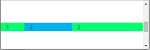
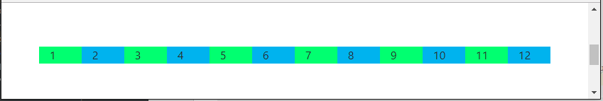
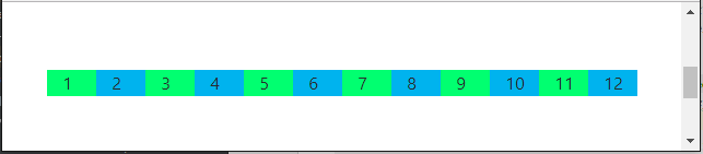
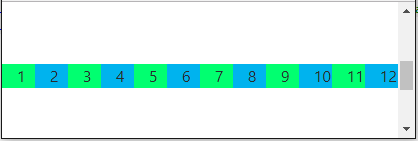
Rows with 12 columns
Like in the version 3, the concept of responsive web page is based on 12 columns that fill each row. Bootstrap defines container CSS class which centers its content on the page adding some padding on the left and the rights side of it. The element with the container class may consist of elements with row class which is also defined by Bootstrap. Each row has 12 columns with equal size that adjust their size to the row width.
<div class="container">
     <div class="row">
         <div class="col-1" style="background-color: #01ff70">1</div>
         <div class="col-1" style="background-color: #00b3ee">2</div>
         <div class="col-1" style="background-color: #01ff70">3</div>
         <div class="col-1" style="background-color: #00b3ee">4</div>
         <div class="col-1" style="background-color: #01ff70">5</div>
         <div class="col-1" style="background-color: #00b3ee">6</div>
         <div class="col-1" style="background-color: #01ff70">7</div>
         <div class="col-1" style="background-color: #00b3ee">8</div>
         <div class="col-1" style="background-color: #01ff70">9</div>
         <div class="col-1" style="background-color: #00b3ee">10</div>
         <div class="col-1" style="background-color: #01ff70">11</div>
         <div class="col-1" style="background-color: #00b3ee">12</div>
     </div>
</div>
The style attributes were added to change background of each column to make them look different. See how they accommodate to the browser window width.
Now, the real work starts with deciding how many of those 12 columns should be occupied by each next level element that you would like to put on the page. CSS class named col-1 means that the element should occupy 1 column. There are many more options. I may want only 3 elements in a row but the first one should use 2 columns, the second one 4 columns and the last one 6. They still occupy 12 columns in total so it is all good.
<div class="container">
     <div class="row">
         <div class="col-2" style="background-color: #01ff70">1</div>
         <div class="col-4" style="background-color: #00b3ee">2</div>
         <div class="col-6" style="background-color: #01ff70">3</div>
     </div>
</div>
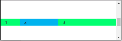
At this point you should notice that col-1, col-2, col-3, col-4, col-5, col-6, col-7, col-8, col-9, col-10, col-11, col-12 are also classes defined by Bootstrap. If you do not want unexpected results, each row should have no more than 12 columns in total.
Different layout for different window widths
Nobody can expect that a complex layout designed for 3840 px width screens will also look good on small screen devices (e.g. 768 px width). It might require some changes in element positions not only their size.
Bootstrap has a solution for this.They categorized screens based on their width into 5 categories. Each of them has a separate set of classes that allow layout definition:
- extra small for width < 576 px has classes with prefix col-
- small for width >= 576 px has classes with prefix col-sm-
- medium for width >= 768 px has classes with prefix col-md-
- large for width > 992 px has classes with prefix col-lg-
- extra large for width >= 1200 px has classes with prefix col-xl-
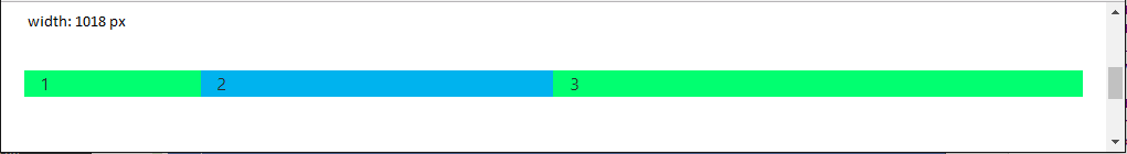
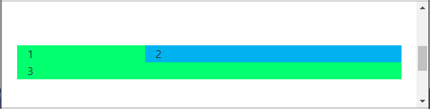
For example when the page is large (> 992 px), all three elements should be in one line occupying 2, 4 and 6 columns but when it gets smaller than 576 px the first two should share 12 columns: 4 + 8, the third one should move to the next line and use all 12 columns.
<div class="container">
     <div class="row">
         <div class="col-4 col-lg-2" style="background-color: #01ff70">1</div>
         <div class="col-8 col-lg-4" style="background-color: #00b3ee">2</div>
         <div class="col-12 col-lg-6" style="background-color: #01ff70">3</div>
     </div>
</div>
When the window is large (> 992 px), all three elements are in one line because of col-lg-* classes.
But when it is resized to anything smaller or equal 992 px, the third element moves to the second line because col-* classes get the voice.
Nesting responsive layout
It is obvious that real web pages have many nested elements. Bootstrap's behavior described above can be applied to all levels of nesting. See below example.
<div class="container">
     <div class="row">
         <div class="col-2" style="background-color: #01ff70">1</div>
         <div class="col-4" style="background-color: #00b3ee">2</div>
         <div class="col-6" style="background-color: #01ff70">
             <div class="row">
                 <div class="col-4">3.1</div>
                 <div class="col-4">3.2</div>
                 <div class="col-4">3.3</div>
             </div>
         </div>
     </div>
</div>
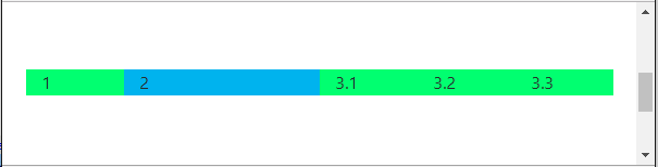
There are three high level divs: the first one occupies 2 columns, the second one - 4 and the third one - 6. The third one consists of three other equally-sized divs.
What is new in Bootstrap 4?
Bootstrap 3 has four groups of classes to create layout. Bootstrap 4 has five: col-, col-sm-, col-md-, col-lg-, col-xl-.
More information can be found on the Bootstrap 4 page about grid system.